Trade in Nothing Phone 1
(Image credit: Future)
If you’re reading this Nothing Phone 1 review, you likely fall into one of two camps: those who’ve never heard of Nothing before, and are wondering exactly what the Phone 1 is; or those who’ve been glued to the story of the London-based startup’s long-anticipated debut smartphone, and are eager to find out whether the wait was worth it now that the hype train has finally pulled into the station.
Nothing remains a mysterious company, with the Phone 1 being only the second physical product it’s released in its short existence, following on from 2021’s Ear 1 true wireless earbuds.
Those inaugural buds (now joined by the October 2022 Nothing Ear (Stick) variant) set the tone for the kind of products the company aspires to make, defining a clear design aesthetic for both the brand and its wares that’s been carried through to the Phone 1.
Ahead of the Phone 1’s launch, Nothing CEO and co-founder Carl Pei (of OnePlus repute) stated early on in its development that it was being made to help inject some joy back into the mobile market. So does it fulfill its purpose?
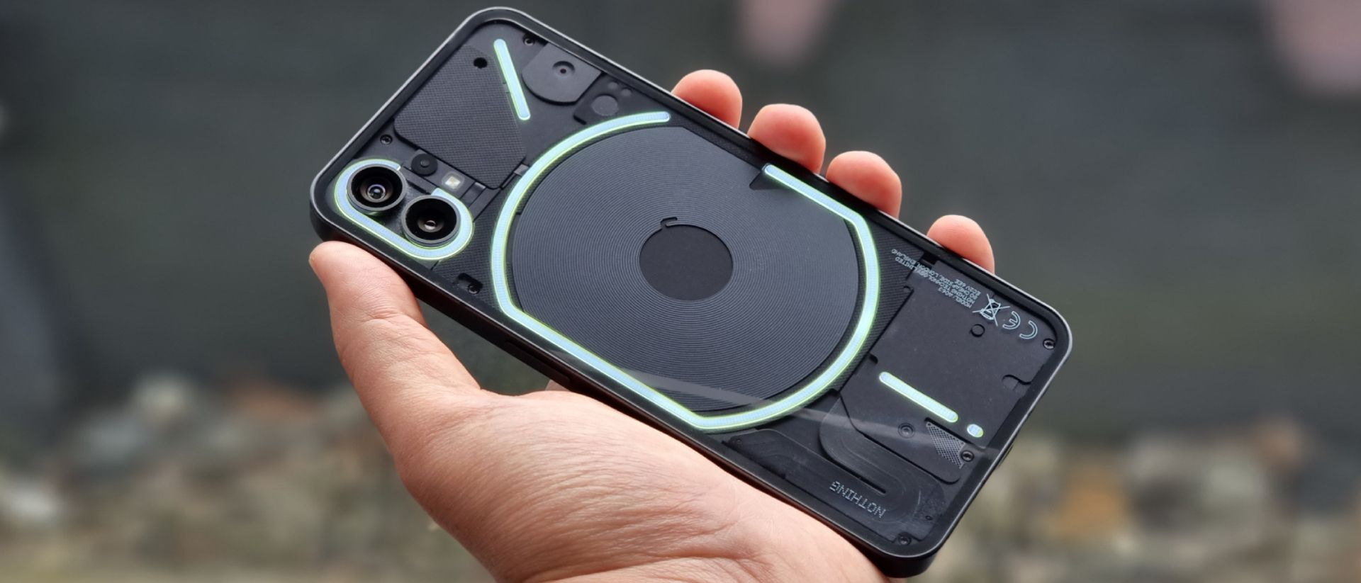
Now that the Phone 1 is here, it’s clearly been made using more than just a check-list of me-too features; with a rear design unlike anything else on the market, functionality – like the Glyph Interface lighting on its back – that offer intrigue and whimsy, and an otherwise well-rounded and capable pairing of software and hardware.
Sure, the cameras aren’t class-leading and battery life leaves something to be desired, but on a technical level, it’s more than capable of serving as your everyday companion and it’s far more interesting than practically every other phone around its price point.
Nothing Phone 1 price and availability
- Starts at £399 / €469 / AU$749
- Officially on sale from July 21
- US release to be confirmed
Nothing unveiled the Phone 1 on July 12, 2022, and the handset formally went on sale on July 21, across the UK, Europe, India, Japan, Hong Kong and Australia.
Ahead of launch, the company had already confirmed a US release will follow at a later date, but couldn’t specify when (it’s speculated that modifications are needed for the Phone 1 to properly leverage the region’s 5G infrastructure).
As for pricing, the Nothing Phone 1 is available in three RAM/storage variants: 8GB / 128GB, 8GB / 256GB, and 12GB / 256GB; priced at £399 / €469 / AU$749, £449 / €499 / AU$799 and £499 / €549 / AU$899, respectively. Those UK prices convert to roughly $475, $530, and $590 in the US.
We are Tradelectronics, licensed second-hand electronics dealer located in Sydney CBD, experts in trading used laptops, old cameras & lens, and used mobile phones. Fast, Reliable & We Pay More! Get a free quote on your favourite WhatsApp, Facebook, SMS & Email, instant reply!
| Click icon for WhatsApp Quote | Click icon for facebook Quote |
 |
 |
- We are open from Mon – Sat 12pm – 7pm
- Get your free quote from WhatsApp and Messenger are highly recommended, we can guide you through in finding the accurate specs for your laptops, cameras & lens, mobile phones as well. As such we can provide a more precise quote for you.
(Image credit: Future)
Ahead of release, a select number of eager fans were given the opportunity to bid on a limited run of 100 engraved devices via the StockX auction platform, even before the finer points of the phone’s hardware and software had even been made public.
Some of those bidders reportedly paid over $3,000 / £2,500 / AU$4,300 for the privilege of being among the first to own a Phone 1.
Separately, Nothing also created an invitation system (not unlike that employed by Pei’s former company, for the original OnePlus One) that allowed those with an invite to join a waitlist to be among the first to pre-order a Phone 1.
Ahead of its general release on July 21, similarly to Ear 1, Nothing also hosted pop-up kiosks in several locations, including London, where interested fans could get hands-on with the device and even pick one up on the spot.
- Value score: 4/5
Nothing Phone 1 design
- Lightweight for its size but a little cumbersome
- Eye-catching transparent-backed design
- Premium fit and finish w/ tactile buttons
- IP53-certified against dust and water
Although we were able to study the Phone 1’s design in Nothing’s official press imagery ahead of its launch, getting hands on the device is unquestionably a richer experience.
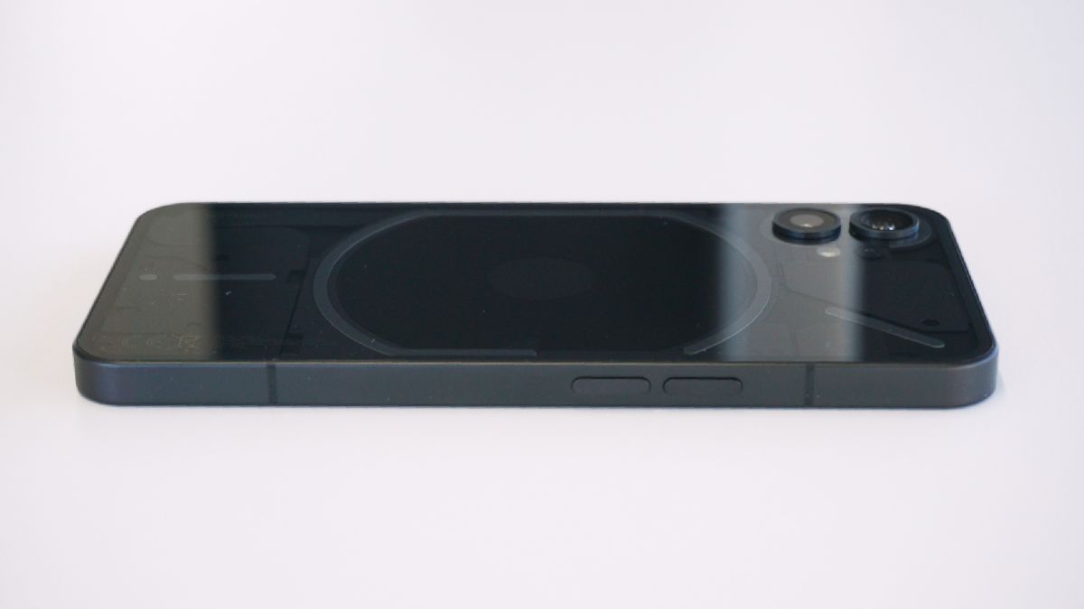
The overall design bears an immediate resemblance to Apple’s iPhone 12, namely due to the Phone 1’s straight-sided metal frame, rounded corners, flat front and back, and dual rear camera placement; just scale it up, run it through an X-ray machine, and voila.
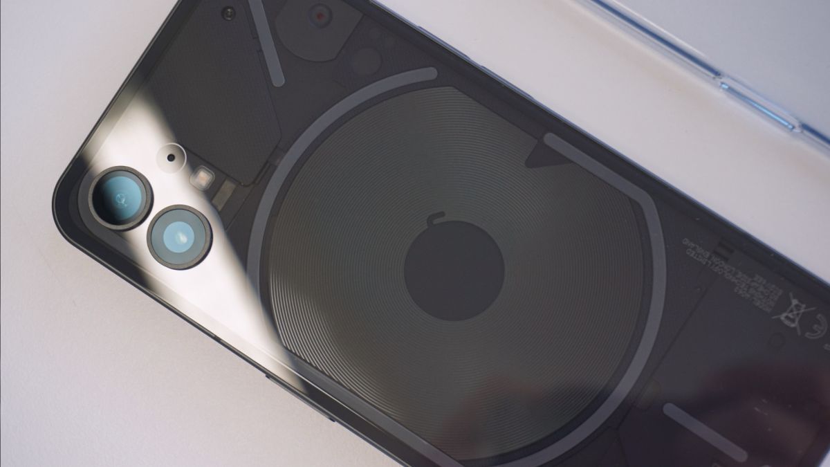
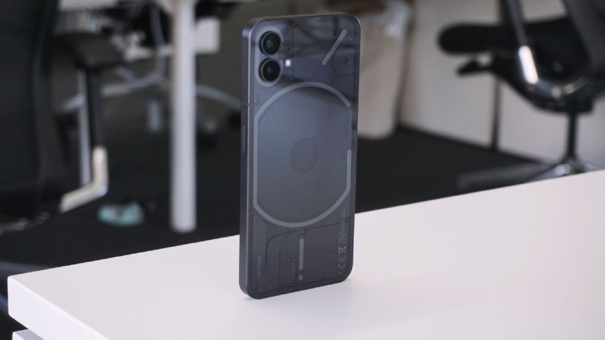
‘Why an X-ray machine?’ you might ask; well, the big hook of the Phone 1’s form is its back – it’s completely transparent.
(Image credit: Future)
While we’ve seen transparent-backed phones before, usually the components underneath are either only partially visible (as on the HTC U12+) or wholly fake (as on Xiaomi’s Mi 8 Explorer Edition). Nothing, for its part, has designed the exposed parts underneath to be both functional and aesthetically pleasing.
As you turn the phone in your hand, the shifting specular highlights and shadows that appear over and under the layers of differently-textured components, screws and ribbon cables beneath the Phone 1’s back glass make it a far more interesting rectangle of electronics to look at than most other phones on the market; not to mention it has Teenage Engineering’s (a trendy Swedish consumer electronics company, who collaborate with Nothing on its industrial design) fingerprints all over it.
Speaking of fingerprints, even with a completely clear Gorilla Glass 5 back, the Phone 1 does a decent job of repelling them, and when you do spot smudges, they buff out easily enough.
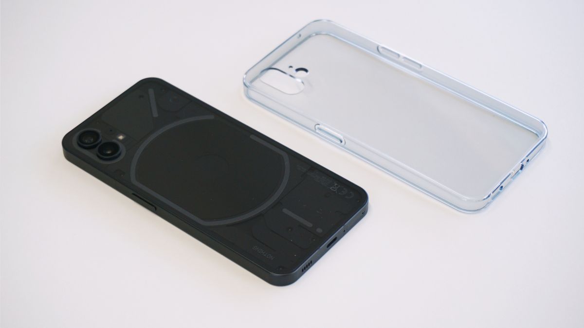
Buyers who spring for an official Phone 1 case might appreciate its clarity out-of-the-box (the case is also, not surprisingly, transparent); however, expect prints to adhere to it far more readily, and require more elbow grease to buff out, than on the phone itself.
(Image credit: Future)
At launch, Nothing serves up the Phone 1 in two finishes: a black model and a white one – with the former offering a more understated appearance, while the latter serves to accentuate that standout design element in a way that’s sure to get people talking when you walk into a bar and casually plonk it down on the table.
Despite its straight sides, the edges of the recycled aluminum frame are subtly rounded to ensure that the Phone 1 is more comfortable in the hand than you’d expect and, what’s more, it feels lighter than its build might suggest – at 193.5g, it sits below the 200-gram threshold beyond which a device’s weight starts to feel noticeable.
The power key on the right side of the frame and the two volume controls on the left are large, easy to reach and respond with a satisfying click, without requiring a lot of force, while IP53-certification means the Phone 1 can be used in a light drizzle without issue, and should prevent dust from working its way into the cavity behind that clear back glass; just don’t drop it in the sink or throw it around at the beach.
Throughout testing, the glass and metalwork didn’t show any obvious signs of wear, save for the pre-fitted plastic screen protector and charging cable, both of which came scuffed out of the box.
This could be down to Nothing’s limited start-up operational capacity – with the company’s small size increasing the chance of quality control slip-ups compared to a well-oiled behemoth like Samsung or Xiaomi – or it could just be a faux pas limited to the press sample we received.
- Design score: 4/5
Nothing Phone 1 Glyph Interface
- Unique LED notification lighting system
- Customizable patterns for ringtones and notifications
- Doubles as fill light when shooting video
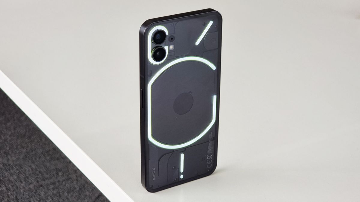
While the phone’s transparent back is a conversation starter, its statement feature is what Nothing has dubbed the Glyph Interface – a series of 900 white LEDs arranged across the phone’s back in a distinct configuration that act as something of a notification light on steroids.
The LEDs are diffused to form bars of light that run around the edge of elements like the rear camera module and wireless charging coil, and each segmented glyph can light up independently of the others. It’s a unique feature that Nothing has put to use in a number of creative ways.
(Image credit: Future)
Dipping into the Glyph Interface’s settings menu, you can customize what the glyphs react to, and when they react. By default, they’re paired to one of Nothing’s 10 own-brand ringtones and notification tones, with the various light and haptic patterns perfectly synchronized – in terms of brightness and motion, respectively – to the audio of each.
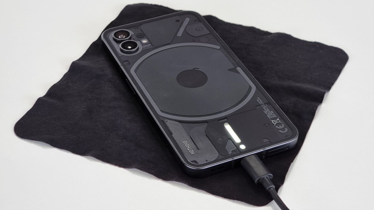
The glyphs’ usefulness goes beyond glanceable notifications, however: they can also act as a battery charge indicator for both wired charging and reverse wireless charging, show when the Google Assistant is listening – signifying it’s picking up your spoken commands, and serve as a soft light when you’re shooting video or portrait mode shots, in place of the camera’s single LED flash.
The blend of novelty and functionality that the Glyph Interface delivers undoubtedly caters to the sense of ‘fun’ that Nothing has so keenly pushed as one of the primary intentions behind the Phone 1, we just wish there was a little more customization and personalization on offer.
The ability to tie different glyph pattern and ringtone pairings to specific contacts in your address book is nice, but there’s unquestionably room to expand this functionality to app-specific notifications (there is a way to enable these but it isn’t intuitive and requires you dig around in Android’s native settings), in-game actions, and the option to compose your own glyph patterns in conjunction with your own tones and tunes would be nice too.
Thankfully, having spoken with the team at Nothing during the phone’s launch, it’s clear that aspects of the Phone 1, including the Glyph Interface will continue to evolve, no doubt influenced by new users, now that the phone is officially on the market.
Nothing Phone 1 display
- 6.55in Full HD+ flexible OLED display
- Adaptive 120Hz refresh rate
- Evenly-sized bezel on all sides
- Low optical in-display fingerprint sensor
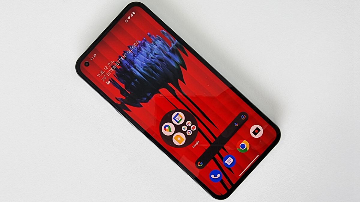
Nothing has graced the Phone 1 with a 6.55-inch Full HD+ OLED panel, boasting a 120Hz high refresh rate, along with HDR10+ compatibility and 10-bit color support.
The screen is surrounded by a not-insignificant bezel, but it claws back some aesthetic points by sporting a consistent thickness all the way around (something that’s not always a given and not easy to achieve from an engineering standpoint), made possible by Nothing’s decision to use a flexible OLED in place of a less expensive rigid panel.
The phone’s punch-hole front-facing camera sits in the top-left corner of the screen, while an optical in-display fingerprint sensor sits low and close to the bottom edge of the panel.
(Image credit: Future)
Despite the technical advantages an OLED display usually brings, there’s no always-on functionality as yet (Nothing hasn’t confirmed whether it’ll add such a feature in at a later date), however, a faint ring demarcating the fingerprint sensor’s placement does linger on the screen when the rest of the display shuts off, and despite the handset offering raise-to-wake functionality, you don’t need to rouse the Phone 1’s display before pressing on the sensor to gain access, which makes it that little bit more convenient
As for the panel’s output, the Full HD+ resolution offers a perfectly sharp image, suited to enjoying social media and streaming video, with brightness generally topping out at a quoted 500nits (with a promised peak brightness of 1200nits) that, in practice, seems wholly serviceable in all scenarios up to bright, direct sunlight where visibility starts to suffer.
The use of OLED tech ensures a vibrant picture, paired to two color profiles: Alive (the default) and the more muted and natural-looking Standard; with a little extra fine-grain control, thanks to a color temperature slider.
A 120Hz high refresh rate, paired to a 240Hz touch response rate means swiping around the Phone 1’s interface – as well as more demanding experiences, like gaming – look and feel pleasingly snappy.
To help with power efficiency, that refresh rate is also dynamic; meaning it can automatically switch up and down in frequency (Hz) based on what the phone is doing; the lower the Hz the less fluid the motion appears on-screen but the less of a drain on the battery the display becomes.
- Display score: 4/5
Nothing Phone 1 audio
- Bluetooth 5.2
- Supports Nothing quick pair
- Good stereo separation
Given that Nothing’s first product was a pair of Bluetooth earbuds, it should come as no surprise that the Phone 1 doesn’t feature a wired headphone jack, instead delivering audio over Bluetooth 5.2.
Nothing’s own quick-pair functionality makes connecting select buds – such as the company’s own Nothing Ear 1 – instantly (although a full list of supported products hasn’t yet been shared).
The phone also sports dual stereo speakers, but understand that it’s not an even split, with the majority of the power being driven from the down-firing speaker, while the earpiece outputs mids and highs.
Clarity is good across the speakers’ range with no real distortion, even setting the volume to 100%. Clarity is respectable, making more nuanced vocals enjoyable, and while bass output isn’t particularly prominent, the phone does impress with the degree of stereo separation it offers up.
- Audio score: 3.5/5
Nothing Phone 1 software
- Near-stock Android user experience
- Nothing OS adds useful, characterful features
- Three years of OS updates, four years security updates guaranteed
- Needs resource optimisation for performance and power
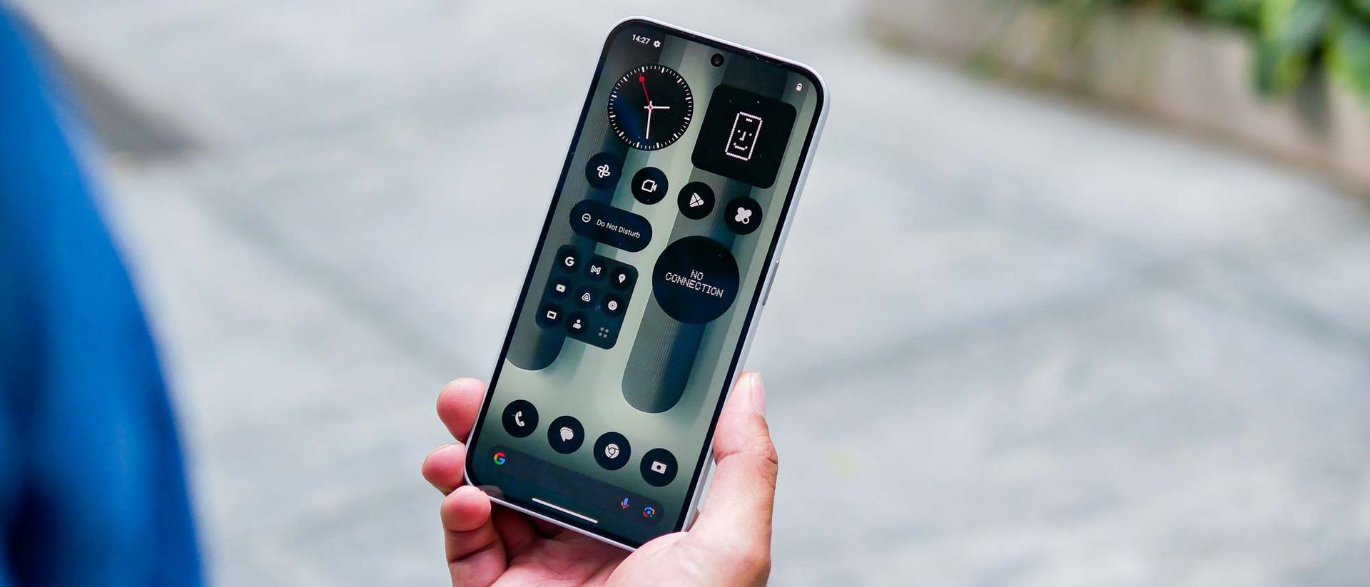
Nothing gave users a taste of its bespoke Android-based user experience ahead of the Phone 1’s launch by releasing a launcher that could be installed on supported phones from other brands; however, the native experience offers a lot more depth.
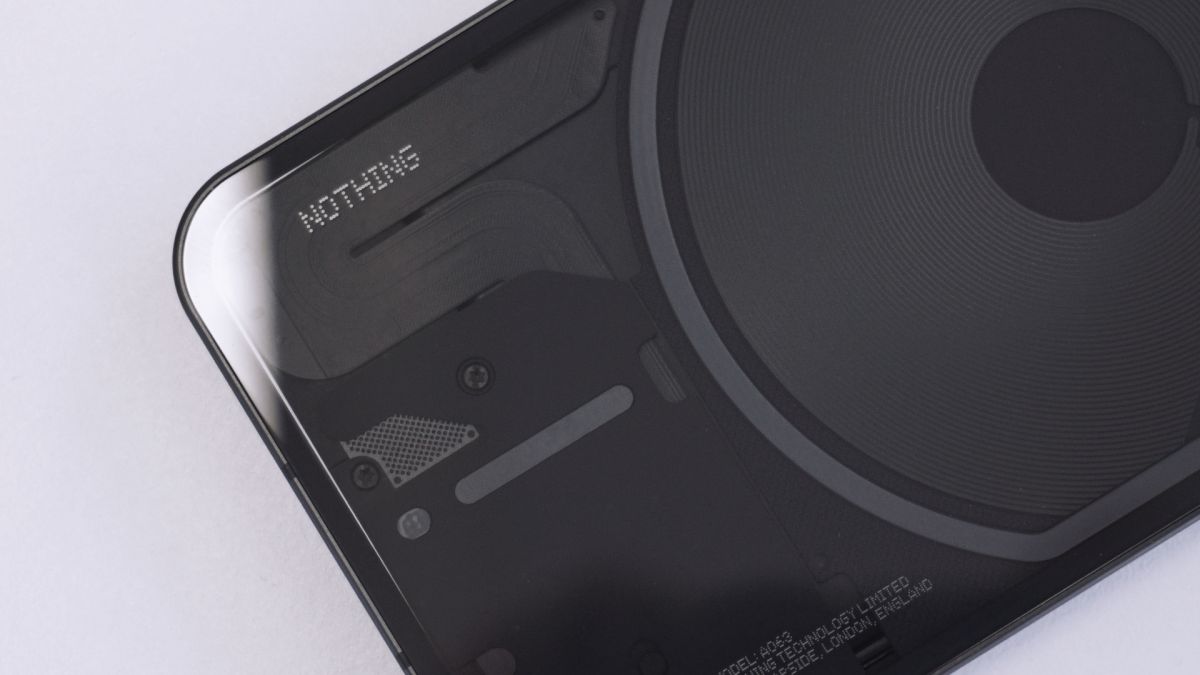
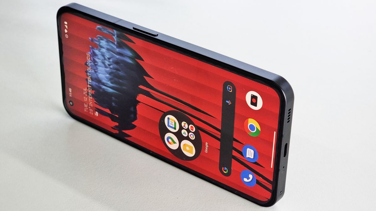
The brand’s signature dot matrix font, which can be found across the phone’s hardware – such as on its glass back and even in the SIM tray – also carries across to the user interface, dubbed ‘Nothing OS’, fronting menus and select widgets.
(Image credit: Future)
Nothing OS falls into a similar camp to that of Motorola’s and Google’s own takes on Android, with mild adjustments that set it apart from a truly stock experience: folders can be enlarged to occupy a 2 x 2 space on a home screen, offering hybrid functionality; specific quick-settings widgets can be swiped through, providing more connectivity options at a glance; and, while it’s tucked away, there’s even a pop-up view for more convenient multitasking.
Some inclusions – like the smart home control shortcut on the lock screen – feel particularly powerful, although there are also signs of work still needing to be done with regards to stability, not to mention there are absent features (such as a one-handed mode) that would benefit the particular user experience offered up by Nothing OS running on the Nothing Phone.
Nothing does deserve kudos for promising three years of OS updates and four years of security updates to Phone 1 owners; making the device that much more appealing in terms of both value for money and longevity.
- Software score: 4/5
Nothing Phone 1 performance and specs
- Older (but tuned) Snapdragon 778G+ chipset
- Up to 12GB RAM
- Responsive everyday performance
- Can handle demanding mobile games
One of the most controversial aspects of the Phone 1 ahead of launch was the reveal of Nothing’s choice of chipset; with the company employing a tuned version of an older seventh-generation Qualcomm SoC: the Snapdragon 778G+.
This comes paired with a base 8GB RAM, but the top-tier model can be had with 12GB, while the ” denotes the inclusion of wireless (up to 15W) and reverse wireless (up to 5W) charging support.
Despite running on more modest silicon than conventional flagship phones, real-world use shows that Nothing’s gamble pays off, at least in part.
The 778G+ won’t win awards based on its benchmarking scores but for most users, should be more than enough for everything from split-screen multitasking to semi-casual gaming – happily handling a few rounds of Call of Duty Mobile with ‘Very High’ graphics and ‘Max’ frame rate settings enabled without issue or noticeable heat build-up.
The real challenge will be how capable the Phone 1 feels after long-term usage and whether Nothing is able to maintain the current quality of performance after a year’s worth of bug fixes, security patches and feature updates.
- Performance score: 4/5
Nothing Phone 1 battery life
- 4,500mAh battery
- Support for 33W fast charging
- Underwhelming longevity
- Fully recharges quickly
Where the 778G+ (and an Android user experience in need of further refinement) does fall down, is with battery longevity and while there’s an argument to be had for the phone’s ability to learn and optimize power management based on usage patterns, baseline longevity underwhelms.
Behind the glass and the visible components, the Phone 1 packs in a 4,500mAh battery, which Nothing claims delivers up to 18 hours of use per charge.
In practice, however, the Phone 1 consistently doled out around five hours of screen-on time, which should be considered the bare minimum for what to expect from a purchase-worthy smartphone.
A single charge handled emails synchronizing from a couple of addresses, about 45 minutes of video streaming, an hour’s social media use, light camera usage, 20 or so minutes of web browsing and messaging, all topped off with 15 minutes of gaming, before sitting at critical battery before bed.
As such, don’t expect to indulge on the Phone 1 and get away with it; you will likely have to put the phone on charge before bed if you’re planning on binge-watching a Netflix series on a long train ride, for example. Anything less demanding and a full day’s use is within reach, but only just.
(Image credit: Future)
As for recharging, the Phone 1’s battery officially refills to 50% in 30 minutes – provided you’ve picked up a compatible PD 3.0/Quick Charge 4.0-compliant adapter that meets the phone’s maximum fast-charging speed of 33W.
Nothing offers its own 45W power adapter (£35 / €35 / around AU$60), but doesn’t include one in the box, meaning all you’ll find is a white USB-C to USB-C cable.
Our unit (using a third-party 27W PD adapter) actually managed to reach over 65% charge after 30 minutes plugged in, with a full charge constantly completing in a sliver over an hour, better than what we were promised.
- Battery score: 2.5/5
Nothing Phone 1 cameras
- Dual 50MP rear cameras + 16MP front camera
- Punchy colors from main Sony sensor
- Glyph Interface can function as a fill light when shooting video
- Grain and lack of detail readily creeps in under low light
While the front-facing snapper clocks in at an unassuming 16MP, both rear cameras pack in the pixels at 50MP a piece.
The main Sony IMX766 sensor – supported by OIS (optical image stabilization) – is ubiquitous amongst phone makers (found on current offerings like the flagship Xiaomi 12 and mid-range OnePlus Nord 2), while the secondary 50MP Samsung JN1 ultrawide delivers a reasonable degree of consistency when switching between the two focal lengths.
(Image credit: Future)
Shooting on the Phone 1 is fun: the shutter is reasonably fast in daylight or artificial lighting and images from the main 50MP Sony sensor serve up a pleasing amount of detail, plus colors that dabble, tastefully, with heightened saturation. This makes it perfectly at home serving up Instagram-worthy shots without much work.
When snapping stuff closer to the primary sensor, there’s an attractive level of bokeh (background blur) that puts out better close-up shots than the phone’s dedicated Macro shooting mode (which relies on the ultrawide rather than the main sensor).
Speaking of the ultrawide, it’s unsurprisingly a slight visual downgrade against the main camera, with weaker, more muted (although perhaps more natural) colors, muddier details and narrower dynamic range. That said, it still serves its purpose, with a nice wide 114-degree field of view that gives you more opportunities to be creative.
In low light, the disparity between the sensors is more prominent, with regards to grain, detail and dynamic range, however, the warmer color temperature that Night Mode shots on the ultrawide sensor sometimes feature have a favorable charm, so long as you don’t crop in too much.
For those curious, using the Glyph Interface as a fill light instead of the phone’s dedicated single LED flash provides a softer, cooler light source to work with, but it has a noticeably shorter throw – so is best used when subjects are nearer the camera.
The highlight of snapping selfies has to be the capable edge detection when using portrait mode, adding a nice level of polish to photos that imply they were taken on a more capable camera than in actuality.
As for video recording, the Phone 1 captures at up to 1080p / 60fps or 4K / 30fps through the rear sensors, with decent OIS (main sensor only) and EIS that does a competent job, even if the vibration made when shooting and walking is still evident in the final footage. It’d just be nice to be able to move between the ultrawide and main sensor while recording.
- Camera score: 3.5/5
Nothing Phone 1 camera samples

(Image credit: Future)
Nothing Phone 1 review scorecard
| Attributes | Notes | Rating |
|---|---|---|
| Design | Great fit and finish underpin an eye-catching design that can put on a (light) show | 4/5 |
| Display | Nothing could do more with the OLED in the Phone 1 but it does its job well | 4/5 |
| Audio | Nothing revolutionary but clear sound with nice stereo separation from the speaker | 3.5/5 |
| Software | A clean Android skin with smart customisations, in need of some small refinements | 4/5 |
| Performance | Great for everyday use and comfortable gaming but might not age gracefully | 4/5 |
| Battery | Gives you a day’s use at best but luckily recharges quickly | 2.5/5 |
| Camera | A fun pair of rear cameras serve up nice quality shots but the system struggles in the dark | 3.5/5 |
| Value | A standout design and a generally well-rounded user experience for the money | 4/5 |
Should I buy the Nothing Phone 1?
(Image credit: Future)
Buy it if…
Don’t buy it if…
Also consider
Curious to know what we think make for suitable alternatives to Nothing’s debut smartphone? Here’s a short list:
Source: Techradar

